Hi friends,
Most of the time we check code on internet and then we copy to our favorite editor software to check the code format, as internet based code are not in proper way of displaying.It helps you to make your bore code look pretty in just a click.
What all its support:-
Java script,C++,CSS,HTML,Java,Perl,Python,SQL,Ruby and many more.
Check Here
http://www.syntaclet.com/
Thanks,
Neha
April 28, 2011
April 27, 2011
HTML Newsletters Guide
Hi Friends,
Newsletters are like a marketing/sales representative of your company for your clients.In the worked of internet, companies are making use of Internet Marketing to do marketing and sales of there services.
But as the Sales representative have some guidelines of "How to Look" to make the first impression same is the case with the newsletters too.So, here are the few basic guidelines for your newsletters:-
1) Say No to Images
We have to understand that the Newsletters are very much different from the websites.Newsletters are depend upon the mail boxes and where by default images are blocked and receiver is only getting a square with the cross sign that image is not coming and moreover your message in image is lost.
So try to avoid images and if you are using images then always design in that way that images are not covering any important message.
2) Alt tag is your friend
Alt tag is the alternative text of the images, so when you are using the images make sure you are utilizing the alt tag very well
you can provide the information what they have in the image by the alt text.Also get extra creative as I used to do...I used to make alt tag as CTA by giving the alt text "Avail FREE Gifts on a click" or "Explore the New Features"
such alt tags create the user to click and give them break from the bore alt tags.
3) Not Everything Should be A tag
Many times designer try to get the click they put the whole content into the a tag but they forget that could actually irritate the users and also we should never
under-estimate the users they can judge by seeing so many links that its just a technique of getting clicks and might hurt your reputation too.
So, the best way to make the special keywords links and not more than 5-6 words in one paragraph
and make sure to leave the default color of links as it will help to recognize them better.
Also, images should also be link always as it is the tendency of users to click on the images and you cant tolerate to loose any single click
4) CTA is most important
CTA (CALL TO ACTION) is the main core thing of the every newsletter and CTA should be bold,clear and having very clear message on it.eg:- Register Now!! , Talk To Us Now!!, Order Now!!, Grab your Copy Now!!
Having 2-3 CTA in newsletter will help you to get the attention of users, but its not necessary to get 2-3 CTA only 1 bold CTA can do the magic but it all depends upon the requirements and design of your.
5) Width and Height matters
Sometimes to adjust our content we don't consider the Height and width of the newsletters and that become a dangerous step for newsletters.Newsletters with lengthy height and big width taking the whole inbox space irritate user.So, always keep a red alarm when crossing the width/height.It is OK to have the Newsletters size can be from 600px to 800px but try to avoid cross that size and also keep checking the length too.Lengthy newsletters means scrolling the content and as we are already checking the NL in the mail box the half of the top is occupied by the mail items, which means above the scroll is occupied we have to design the newsletter is such a way so that we could avoid too much scrolling.
6) Subject Line
Subject line of newsletters is like the envelope of your mail, if the user didn't like the envelope he never gonna open it.So while selecting the subject line make sure it is attractive subject line enough to make receiver to click on it and open your mail.
7) Content is king here too
Like web the content is king here too but like web don't make one page content.Write your content short and straight.Also, try to break your content in sub-parts or sections.You can also add bullets points and heading to make your content readable.Make the key points BOLD.So that in first look the user can scan the bold points first.
April 14, 2011
My Journey to Internet Marketing
Hi Friends,
Thanks to my previous job I got myself into new world of Internet Marketing.For me internet Marketing was just about SEO, link building, alt tags etc.But I was totally wrong.
But I am happy to get myself to internet marketing and to challenge my skills as web designer and graphic
designer.
We as designer when ever present our website design to client we always say LOADS of beautiful stuff about our design and claims that by keeping in mind the target audience and user we have done the navigation,images or Blah Blah.
But do we actually read or study our target audience?Do we ever design and then re-design our website on the basis of our target audience response?Do we ever measure our design effectiveness?The strong area the weak area?
Thanks to "Internet Marketing" where it is all about study and read your audience behavior, there like there dislike, to LOVE them in short.
First lesson I learned in Internet Marketing is to not design for yourself design for your target audience.you have to keep yourself in some others shoes and then start your thinking process.
Internet marketing is all about measuring the ROI of your every design.you can sit and check each and every thing where the user click most and from where he comes to where he goes and where he drop.
Internet Marketing is related to Paid and free, so getting maximum ROI from that is the biggest challenge for the designer,especially when you are designing newsletters and e mailers...you have to drop all the graphics, all images and go back to the table codes and design by keeping in mind that the what if images will be block? What if user is too busy to open email..what should we keep the subject line to make him open the email?
So, designing for internet marketing is very different from the website designing.But it is fun and challenging too.It is fun to study your audience to fall in love with them , to keep experimenting new things, to keep measuring your design effectiveness, its success rate.Challenge is to get maximum ROI.
I really want to admit this that just because of my exposure to internet marketing, I am able to re-work on my website design concepts and design.Now, I design and test and check the result and then re-design again.This really help me to stand out of crowd of other designers.
Thanks,
Neha
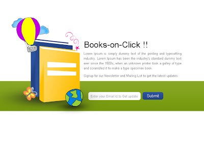
Coming Soon Page for the Book Portal
Hi Friends,
Please check the coming soon page designed by me for the books portal.
Content is all dummy.Feedback is welcome :)
Thanks,
Neha
Please check the coming soon page designed by me for the books portal.
Content is all dummy.Feedback is welcome :)

Thanks,
Neha
Conceptual Hindi Serial Poster
India is famous for its Bollywood Industry, all the songs, dance and all jazzy things.Same is the Indian Serials, which is most viewable in every Indian house.So, today I am showing you the few serials poster to have the inspiration from that.Have a look to see how the designers have design the poster to reflect the whole concept of the serial with some *Indian Melodrama*


Sorry if I missed any your favorite Serial!!
Thanks!!


Sorry if I missed any your favorite Serial!!
Thanks!!
What is New Here?
Hi Friends,
So after such a long time... I am back to my blog..sorry for no post.As other things were keeping me busy last days, which were my job and freelance work.I learned a lot in internet marketing area and front end development(Well, still learning).
So, keep in touch for new interesting blogs and post.
Thanks,
Neha
Subscribe to:
Posts (Atom)